
Halliburton
I designed and delivered multiple wireframes, prototypes, and high-fidelity UX/UI designs. I translated complex industry data into clear, engaging solutions for a new customer-facing portal. Interactive designs were created using user flows, site maps, and wireframes, while printable reports were revamped with reusable components to save time and cost.
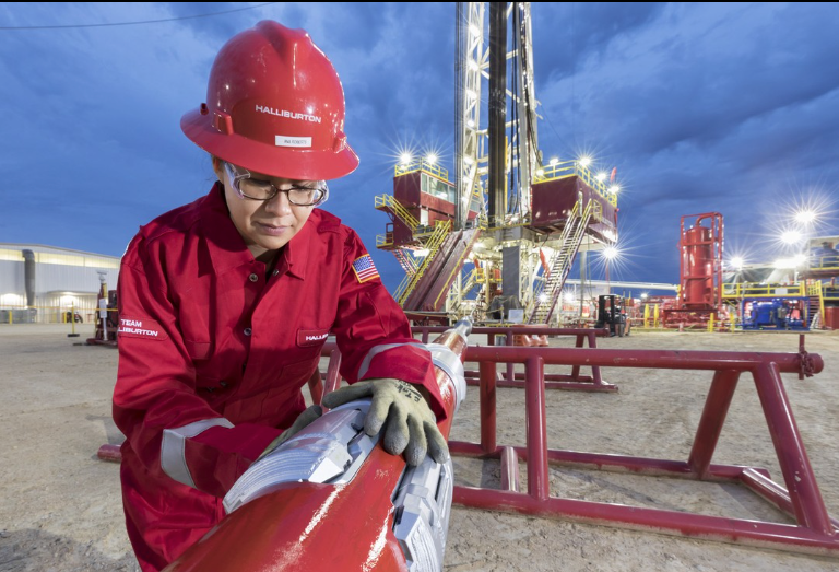
Halliburton is one of the world’s largest providers of products and services to the energy industry, primarily focused on oil and gas exploration, development, and production. It serves both national and independent oil and gas companies, offering a wide range of services including drilling, formation evaluation, well construction, production optimization, and reservoir management.
Timeline:
7 months (April 2023)
7 months (April 2023)
Role:
Document old process, interview users, organize focus group, create user task flow, create updated user interface using Figma, build prototype
Document old process, interview users, organize focus group, create user task flow, create updated user interface using Figma, build prototype
Tools:
Figma, Photoshop, Illustrator, Usability Hub, AME
Figma, Photoshop, Illustrator, Usability Hub, AME
Deliverables:
User Flow Diagram, Wireframes, Interactive Prototypes, Preference, Testings, Mockup
User Flow Diagram, Wireframes, Interactive Prototypes, Preference, Testings, Mockup
Fracking Software
About the Product: On a fracking site, engineer and production workers need to monitor drilling and production progress for each well. For each wellbore drilled, workers need to measure angle, depth and width. They also need to monitor the amount of proppant and chemicals delivered to the site, the amount released into the wellbore. Halliburton customers also need to view a summary of these observations from any location. To view these intricate observations, desktop software, as well as a, robust web app is needed to keep track of every facet of the drilling and production phase.

Discovery:
1. On average, 3-7 engineer and production workers input information into the software during any given day.
2. Engineers used a combination of the 3 different software products along with excel sheets and email to execute their monitoring and reporting duties.
3. There was no clear indication of what step a user is in when entering information.
4. Unnecessary clicks forced users to exert additional effort
Solution:
1. Create one software system to monitor drilling activity, management inventory of chemical usage, and communicate reports to quality assurance and the Halliburton customer base.
2. Modernized the interface of the software mainly to appeal to the new customer base.
3. Make the software workflow follow the workflow of users on the fracking sites.
4. Create panels within the software so users can easily distinguish between their own well information vs site welling information.

User Flow Diagram:
User flow from login to using the writing function and logging out.


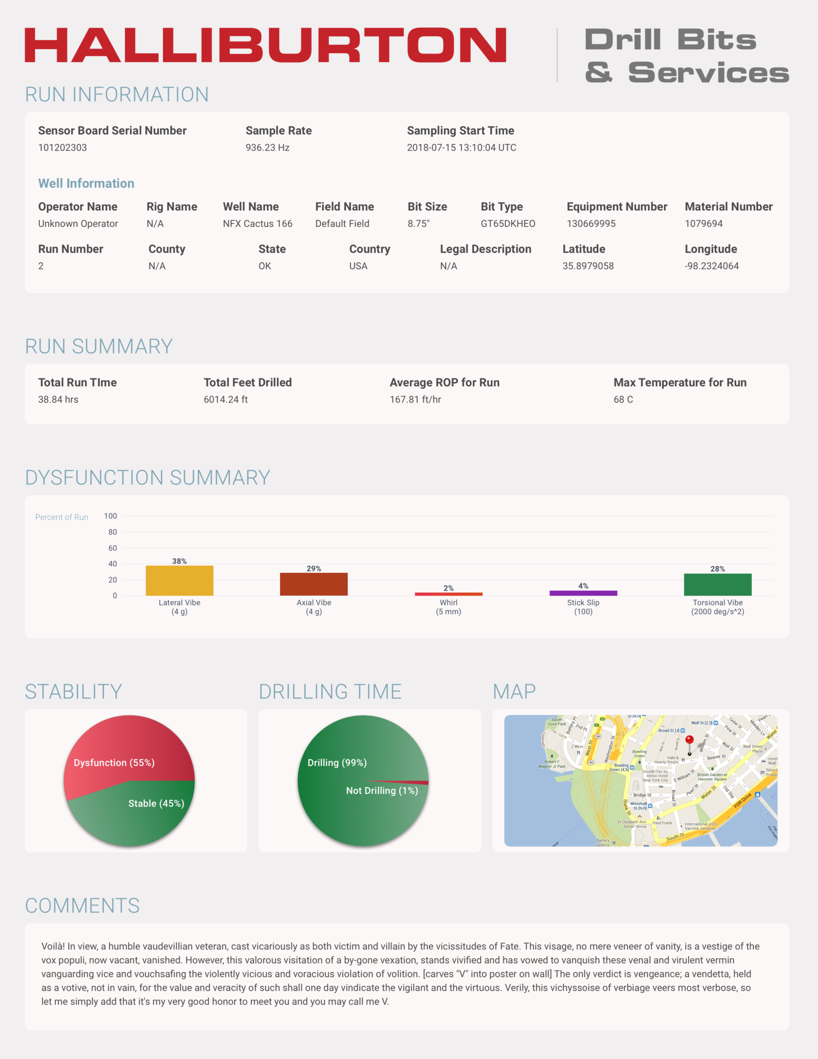
Halliburton Drill Depth Reports
UX Challenge:
I assist in redesigning a selection of printable reports for their drilling equipment. Their current reports were not expandable and could not be shared by similar functioning teams. they were outdated. Largely a visual design project, there was still need to distill what the most important data points were and create hierarchy of priority. What I helped the company settle on is a clean, easy to understand, and visually appealing record of drill activity with modular components that can be reused.
I assist in redesigning a selection of printable reports for their drilling equipment. Their current reports were not expandable and could not be shared by similar functioning teams. they were outdated. Largely a visual design project, there was still need to distill what the most important data points were and create hierarchy of priority. What I helped the company settle on is a clean, easy to understand, and visually appealing record of drill activity with modular components that can be reused.
UX Impact:
TIME and MONEY. For a company the size of Halliburton, having reusable components that can be shared to different functioning areas can easily translate to savings in the hundreds of millions of dollars, and hundreds of thousands of man hours. No need to create custom components for each print type. No need for additional training on their use.
TIME and MONEY. For a company the size of Halliburton, having reusable components that can be shared to different functioning areas can easily translate to savings in the hundreds of millions of dollars, and hundreds of thousands of man hours. No need to create custom components for each print type. No need for additional training on their use.


Candlestick Threshold Legend: I had the idea to use this candlestick design (borrowed from my experience in cryptocurrency design and FinTech) to show the fluctuations in drill intensity.
Flow Threshold Legend: This is the view that was implemented. According to the team, the changes in depth and magnitude are actually not so gradual as the chart implies, but loved the idea of superimposing the data points.
Final Design
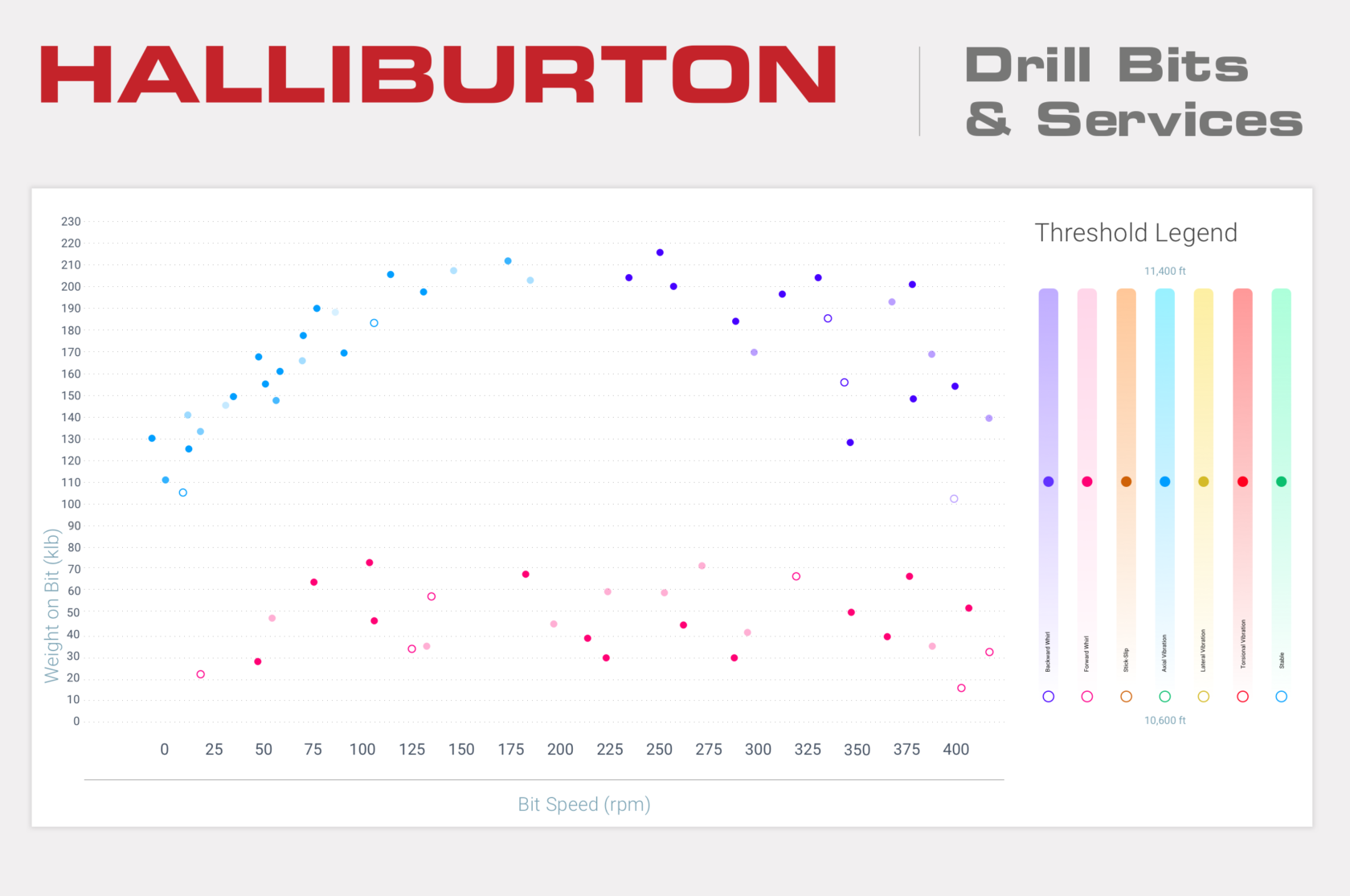
This view took several revisions to settle on. Even this one that was finally approved still gives me some pause from an accessibility standpoint. I did urge them to ultimately settle on better contrasting colors (these were from their in-house visual designer). Halliburton has a range of allowances they can work within regarding branding, reporting, and ADA. They assured me this was within range.

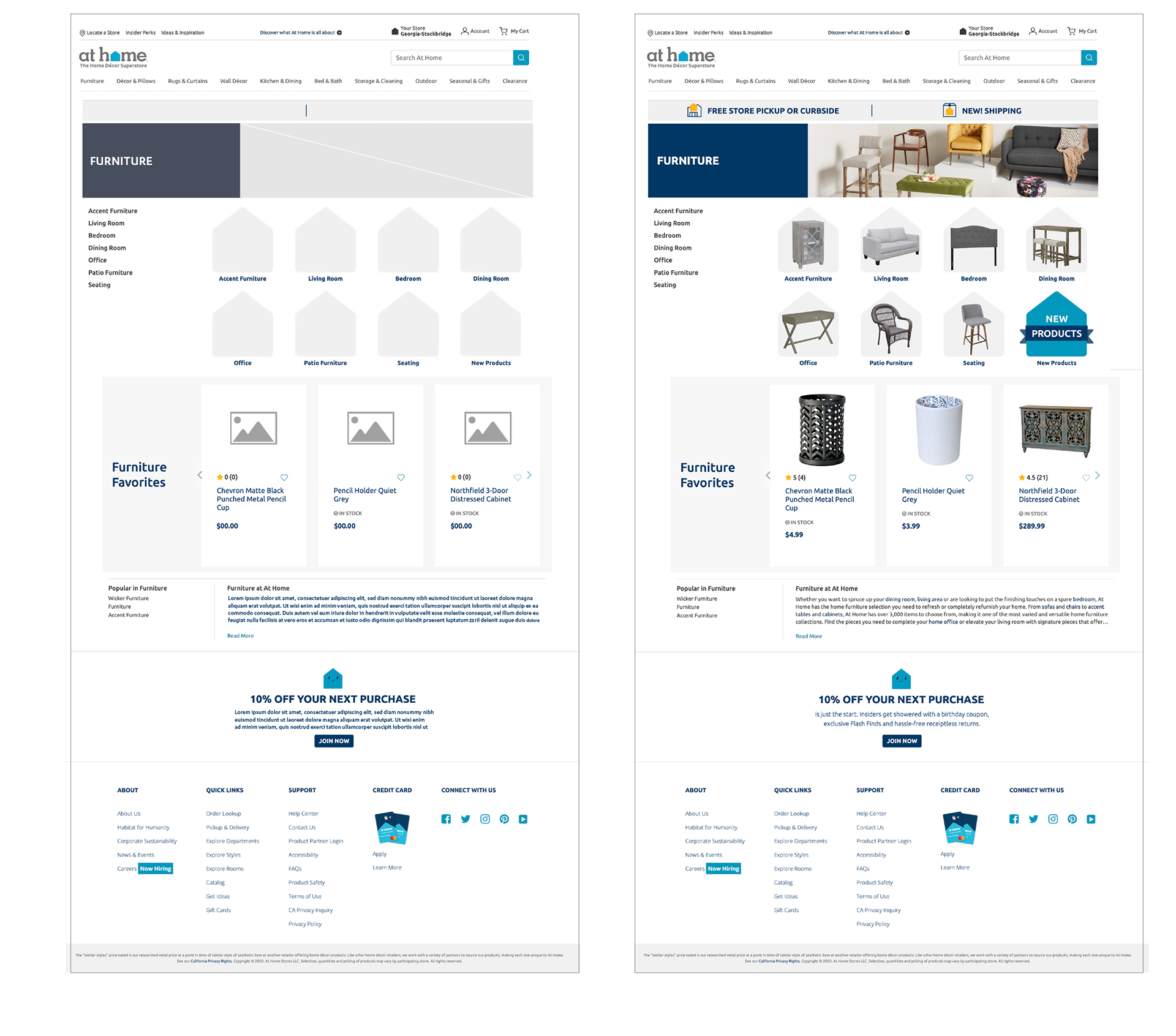
At Home
I designed and executed visually compelling marketing campaigns that boosted brand engagement by 40% and led to a 25% increase in conversion rates across key digital platforms. By creating over 150 high-impact digital assets I supported a multi-channel strategy that enhanced online visibility by 60%.
At Home Group Inc. is a home décor superstore chain offering a vast selection of furniture, home furnishings, wall decor, decorative accents, rugs, and housewares. With over 260 stores across 40 states, At Home provides stylish and affordable products for every room, catering to a wide range of tastes and budgets.
Objective
To break the product page with elegant shopping bag page to keep the users attention focused on products.
Challenges
There were two key challenges I had to tackle in this project:
1. Having a wide variety of short and cheeky sayings for the word count within the speech bubbles. Worked with a copywriter to make sure the consistent brand feel was across each selected products.
2. After the UI team lunched prototype, several of the larger product images needed to be manual resized to fit product spaces due to speech bubble.
Timeline:
3 weeks (Mar 2021)
3 weeks (Mar 2021)
My Role:
UX Designer for Desktop,
Branding & Visual Design, Production Artist
UX Designer for Desktop,
Branding & Visual Design, Production Artist
Tools:
Figma, Photoshop, Illustrator,
Usability Hub, AME
Figma, Photoshop, Illustrator,
Usability Hub, AME
Deliverables:
Updated Brand Guideline,
User Flow Diagram,
Wireframes, Preference Testings,
Desktop Mockup
Updated Brand Guideline,
User Flow Diagram,
Wireframes, Preference Testings,
Desktop Mockup
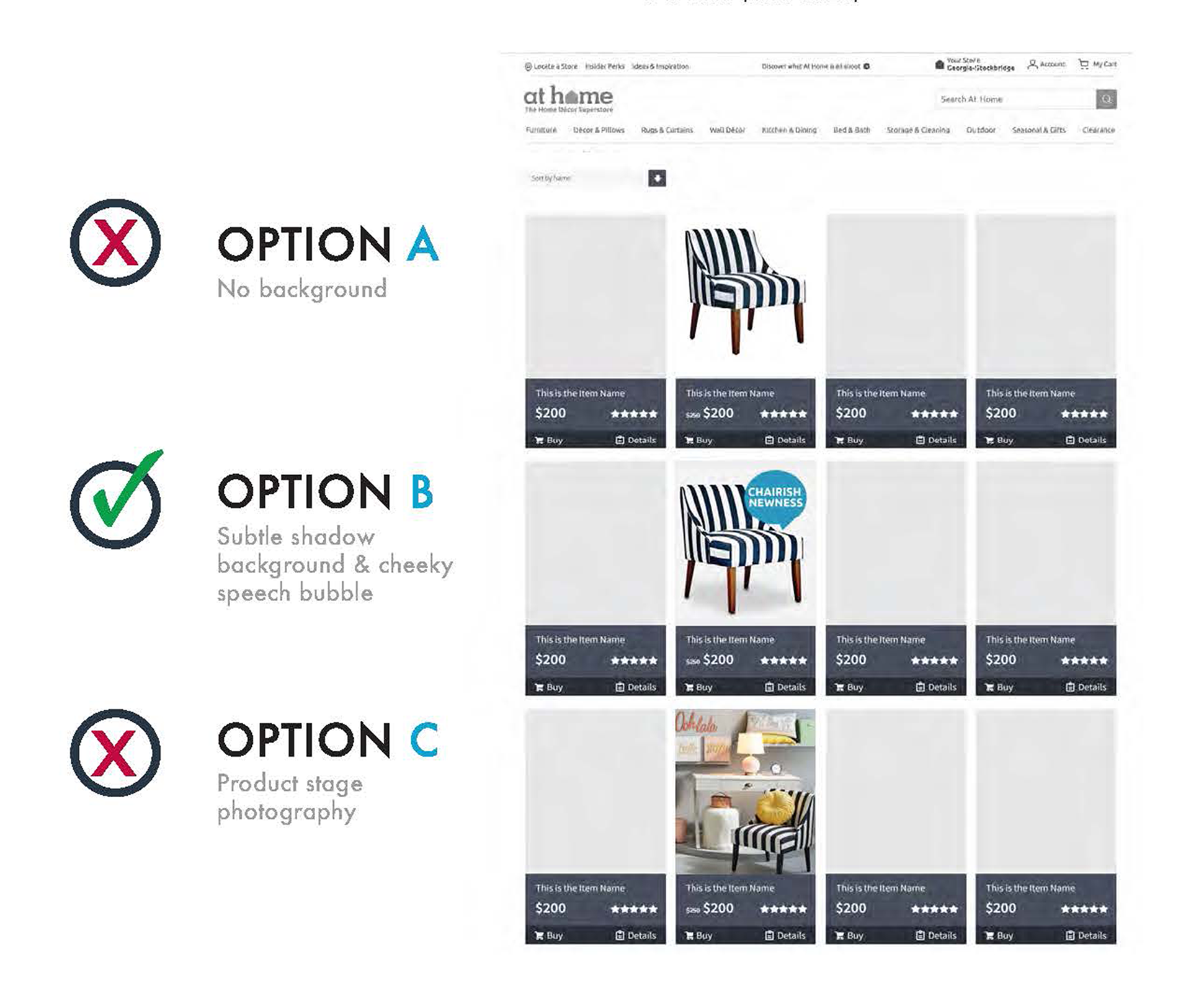
Starting out with two initial ideas: pure white background for ultimate clean look and products in the environment they are intended to be used for immersive feel.

Both of them did not work very well visually first one due to overly floaty look where products didnʼt form strong enough connection to the titles. Products in the environment proved to look great on individual product page, but gave to cluttered feel on pages where lots of items were showed at once.

Final Design
Option B emerged as the winner, offering a balanced compromise between both products. Set against a subtle background, it delivered strong consistency and was highly praised by testers.

Wire framing
To validate my thoughts and ideas, I sketched out possible design solutions with pen and paper before turning them to digital wireframes with Adobe XD. These low-fidelity wireframes allowed me to run tests with potential users early on the process.
Secondary Page
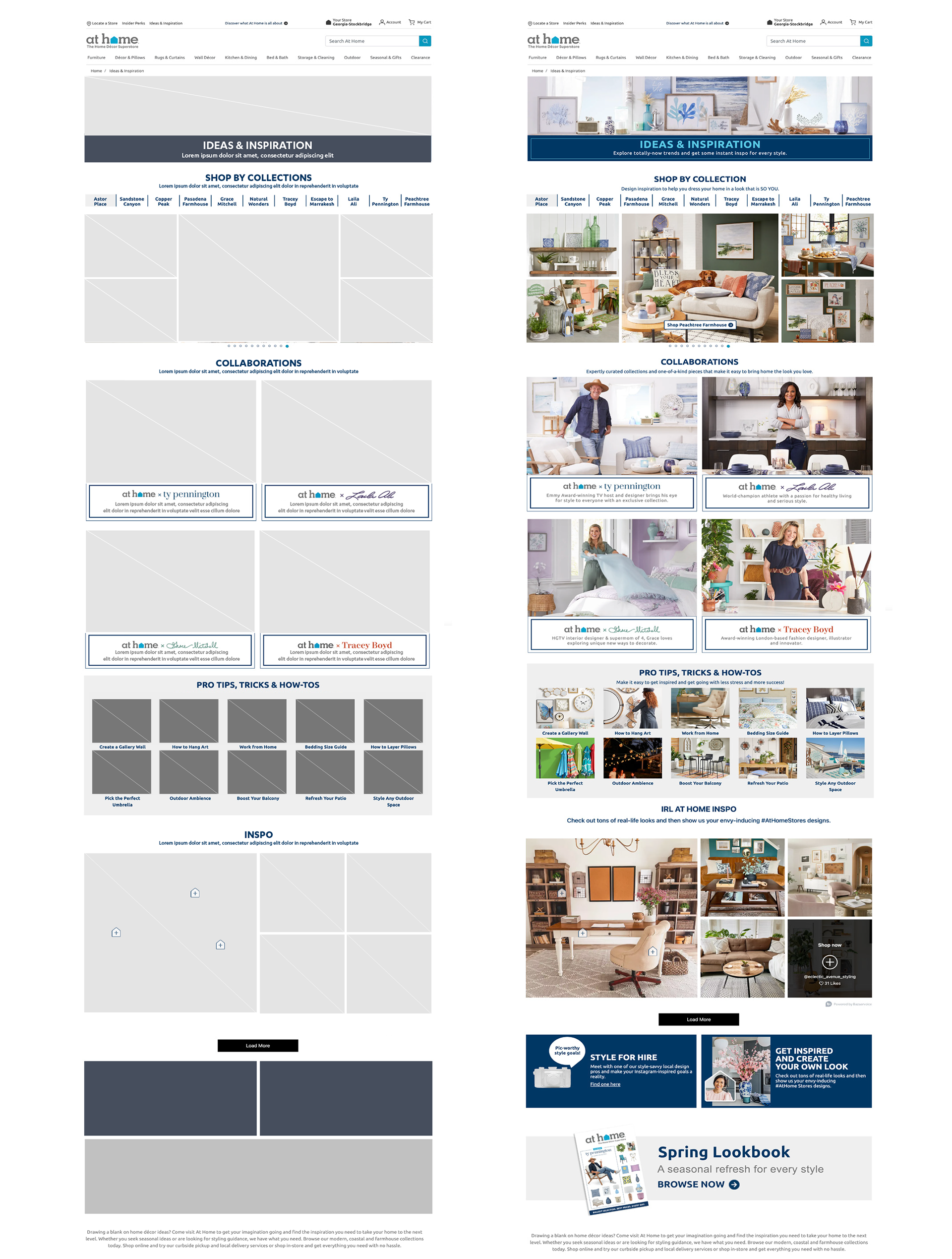
Product Page